All posts by admin

Understand Channel in Forex

Channel is one of the tools of technical analysis which is the development of the trendline. How to draw quite simple, we just duplicate the trendline that we have made. The steps, the first time we are drawing the first trendline in accordance with the direction of the trend. In the image below, for example, we draw a trendline on the current uptrend.

upchannel


Then, we draw a line parallel to the trendline. This second line then we project that connects the dots peak. Similarly, the trendline, this line must be at least connecting the two peaks. Be a UP CHANNEL or also commonly referred to as ASCENDING CHANNEL. Simple right?

As for drawing a CHANNEL DOWN; or often referred to as DESCENDING CHANNEL; as simple as drawing a bullish channel. First, the first image trendline that connects at least two peaks. Then create a line parallel to the trendline connecting at least two valleys. Below is an example of down channel.
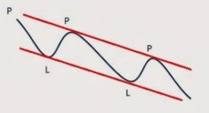
downchannel


Although, this channel is very useful. These channels can later be utilized to estimate the area of buy or sell. The second line of the channel serves as support and resistance. The line that above serves as resistance, while the line below serves as a support. To make it easy we call it the two lines as lines of support and resistance lines.


When prices are in the area support line, then we can try to look for confirmation in the form of a bullish signal to buy, with a target at the resistance line. Beware if the price breaks below the support line. If it happens, it’s good to consider removing such transactions. Of course, this will also have to see the development of the market situation. This issue will be discussed later, in the topic further.


Similarly, when prices are in the area resistance line. At that time we could try to look for bearish confirmation signal to sell with a target at the support line. Of course, we should be wary if the resistance line breaks after we do sell.


Sideways Channel
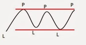
sidewaychannel

There are times when prices move sideways, so we can not draw up the channel or channel down well. In these circumstances, we can draw a horizontal channel. We call this channel such as a channel or ranging sideways channel.


Below is an example of a graph that presents three types of channels that we have discussed, the channel up, channel down and sideways channel.

 

channel

The Trendline in Forex

The trendline is a very common tool used in technical analysis. In fact, its role is very important, because most good trading strategy it is a trend-following trading price movement. If we can draw a trendline correctly, then these lines can be as accurate as other methods of trading. So prepare yourself to better recognize simple line called this trendline, which unfortunately a lot of overlooked by traders. Lots of traders are still wrong in drawing a trendline, whereas simple lines are the core of technical analysis along with support and resistance.


OK, before going any further, we will discuss the types of trends first. Basically, there are only three trends: rising (uptrend), down (downtrend) and flat (sideways). We will discuss them one by one.


1. The upward trend (uptrend)

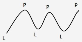
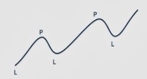
It’s simple: the ascending trend (uptrend) is the state when prices are moving up. But still, there are prerequisites to determine that the market is in an uptrend. Consider the following picture.

uptrendline

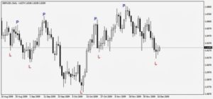
Caption: P = Peak (Peak), L = Valley (Trough)


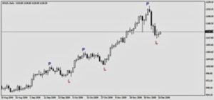
Prerequisites uptrend is their series of PEAK (peak) of the higher and TROUGH (valley) were also higher. Because of the word “series”, there should be more than one. That is, there must be a minimum of two peaks in the two valleys MORE AND HIGH.


Examples uptrend in the candlestick chart:

uptrendlinegrafik


2. Downtrend (downtrend)

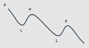
Unnecessarily complicated-complicated: down trend (downtrend) is the state when prices are moving down. But as the uptrend, there are also prerequisites.

downtrendline

Caption: P = Peak (Peak), L = Valley (Trough)

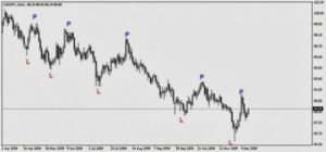
Prerequisites downtrend is their series of PEAK (peak) increasingly valley and TROUGH (valley) were also lower. Because of the word “series”, then there should be more than one. That is, there must be a minimum of two peaks in the two valleys MORE AND LOW.

Example downtrend on a candlestick chart:

downtrendlinegrafik


3. Flat (sideways)

Well, this is too simple. It means not sideway movement uptrend and downtrend instead. What does it mean? Yes, flat course. Remain there up and down but is limited in a certain range. In other words, there must be on the uptrend or downtrend can not be found.

sidewaytrendline

Caption: P = Peak (Peak), L = Valley (Trough)


Example sideways on a candlestick chart:

sidewaytrendlinegrafik

Learn Forex Trading Strategy Using MACD

MACD and Parabolic SAR


At this time, we will try and analyze a forex trading strategies using the indicator MACD Crossover with Parabolic SAR indicator in chart 1 hour late. The second indicator is a standard technical tool owned by Metatrader.


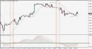
In the example graph below, the pair that will be used is the EUR / USD with a 1 hourly chart which at the bottom of the chart is the MACD indicator, while at the top of the chart is the Parabolic SAR indicator with the green dotted line.


macd-and-parabolicsar


In the graph above, there are two scenarios that must be considered based on the strategy that we will discuss. Starting from the left side, and around 05:00, June 27, 2014, we see the indicator MACD signal line penetrates from the bottom to the top which indicates the price will move up, and added a few moments later Parabolic SAR indicator also gives an indication will move to the top which is marked by the dot indicator is below price.


With anticipation, the price will continue moving upwards until about noon on June 30, 2014, when the dot parabolic SAR indicator is above price start giving confusing signals.


For this trade MACD indicator has done a crossover on the signal line and confirmed by dot parabolic SAR indicator moves above the price which are the exit point which gives a potential 70-point advantage.


Some time later, on July 2, 2014, shows that the Parabolic SAR indicator moves above the price which are followed by the MACD indicator moves down through the line signal and generating price moves in line with expectations when the Parabolic SAR indicator moves below the price. The result was a profit of about 80 pips, with the profits to be taken when a signal of price moves back below the Parabolic SAR indicator.


Easy … right? But be aware that this strategy should be tried first on a demo account so that we can have the right feel when we use.


MACD Divergence or Convergence


This strategy is the most basic strategies for utilizing the indicator MACD crossover by using a divergence or convergence between price and indicator is a signal that is considered important by technical analysts and consequently regarded as a great opportunity when the signal has been identified.


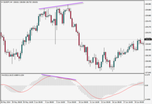
In the 4-hourly chart, the pair EUR / JPY


macd-divergence


The MACD indicator successfully made the highest bar on 4 April 2014 and started moving downtrend around June 9, 2014. On the other hand, the price continues to move higher and higher even against the MACD indicator which consolidate into a triangular pattern on the side of creating a pattern of divergence with the MACD.


Furthermore, the MACD indicator continues to move downwards to penetrate the signal line on June 10, 2014, and finally, downtrend and the price moves MACD indicator confirms movement breakout move down the final profit of about 130 points if a trader opens position near the entry to crossover.


Indeed, the divergence between price and indicator signals a change in the long term, as seen by the movement of prices in the chart above.

Learn Support and Resistance in Forex

Now we will try to understand and recognize what “support” and “resistance” in Forex

Perhaps you still remember the concept of supply and demand (supply and demand)? When a request (demand) increased and supply (supply) down, then prices will go up. Conversely, if the offer (supply) rises and the demand (demand) down, prices will drop. That said economics teacher during junior high.


Well, in fact, the price of the currency in the market is always moving up and down. It is also influenced by supply and demand on the currency. Then, there was a time in the market where the price stops moving up or moving down stops. This is certainly due to demand or supply it is not large enough to cause prices to rise or fall.


In technical analysis, we can anticipate roughly when supply or demand increases. The trick is to identify support and resistance level that was.


Support is an area where the price level at that level DEMAND large enough to withstand the decline in prices. At this level, the price tends to stop moving down and likely to rise again. Practical language, the support level is expected to hold its bearish movement.

While resistance is an area in which the price level at that level SUPPLY large enough to stop the rise in prices. At this level, the price tends to stop moving up and will likely fall again. Practical language, the resistance level is expected to hold its bullish movement.

Now let us look at the following picture:
forexsupportandresistant

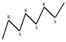
The above example shows the line zig-zag form graph moving upwards. When the price goes up and then down again, then the highest point reached before descending again that’s called resistance.

When the price moves up again, the lowest point reached before the price goes up again that we refer to as support. That’s how we determine the support and resistance levels in line with price movements up and down all the time.

Please also note that the level of support and resistance is not necessarily a definite level. That is only natural that some traders disputing some of the numbers when determining support and resistance. Importantly, the support and the resistance is in the range of numbers that are not too far away.


Resistance becomes support, support becomes resistance


Do not be confused. Indeed the case. Here’s the story …


Although at the beginning of the discussion of support and resistance is said that these levels were able to “hold back” the rate of price movement, but it does not mean that these levels will last forever. A support will no longer be able to withstand the downward movement if it turns on when the demand is no longer big enough. In contrast, the same thing will happen to the resistance, in which the supply is no longer large enough to withstand the upward movement.


Imagine you are standing in regards to a room. There are a floor and ceiling. Ceiling our analogy as resistance, while our analogy as a support floor. In your hands, there is a golf ball. You throw the golf ball up to touch the ceiling. If your throw is not strong enough, then the golf ball will bounce again downward.

How to Read Forex Chart

In the world of forex trading, when people talk about the technical analysis that first comes to mind is a graph (chart). The technician usually do use charts because it is the easiest way to visualize the data of price movements over time. We can draw a graph to help us identify trends and find patterns that could potentially lead us to achieve an incredible opportunity.


There are three types of charts in technical analysis,  will be explained one by one.


  1. Line chart

linechart

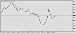
Line chart is a graph of the simplest depicted as a line connecting the closing prices. For example: in a few days in a row trading closed at a price of 100, 200, 150, 250 … then the price levels are connected by a straight line. With this graph we can see the general price movement within a specific time period.


An example is shown below:


  1. Bar chart

barchart

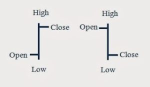
The bar chart is slightly more complicated than the line chart. Chart provides information on the type of the opening price, closing, highest and lowest prices within a certain time period. Because it has such information, this chart also called OHLC chart (Open-High-Low-Close). Here is the basic form of a bar chart:


The lower end of this chart is the lowest price ever traded within a specific time period, while the upper end is the highest price. The vertical lines represent the range (range) price in that time period. Small horizontal line which is located on the left is the opening price while those on the right is the closing price. In the above example, the opening of the nutrient are lower than the closing price. However, the opening price may be higher than the closing price.


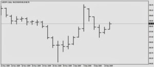
Examples bar chart in the chart is as follows:

barchart2


In simple terms we can say that the bar is a period of time, whether it be one month, one week, one day, one hour, or even minute. Depending on the time frame of how long we plot the chart.


  1. Candlestick chart

candlestickchart

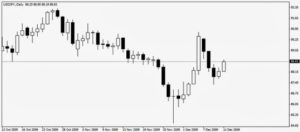
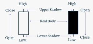
Named the “candlestick” because it looks like with a candle. His full name is “Japanese candlestick chart” because supposedly he comes from Sakura country. Chart of this type provides the exact same information with a bar chart, only “posture” over her “sexy”.


The basic shape and how to read is as follows:

candlestickchart2